

✔️flexbox의 특징
1. display: flex 는 모든 요소를 가로로 둔다.
2. display: flex는 부모한테 적용하고 자손을 컨트롤한다.
3. justify-content : 가로로 요소들을 움직인다. (flex-start, center, flex-end, space-between, space-around 등의 값이 있음)
4. align-items: 세로로 요소들을 움직인다. (flex-start, center, flex-end 등 적용가능)
5. flex-direction:column 가로로 정렬된 요소를 세로로 바꾸고 justify-content는 세로로 align-items는 가로방향으로 바뀐다.
✔️예시
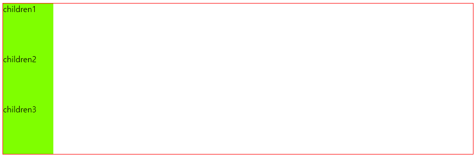
    <div class="mother">
        <div class="children">children1</div>
        <div class="children">children2</div>
        <div class="children">children3</div>
</div>- 부모 태그에 자식태그 3개를 감싼 형태.
▶display: flex 는 모든 요소를 가로로 둔다.
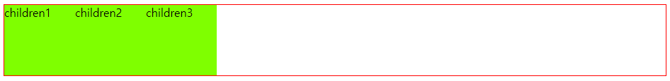
.mother{
    border: 1px solid red;
    display: flex;
}
- 부모태그에 display:flex 를 적용하니 세로로 나열돼있던게 가로로 바뀌었다.
- display:flex 는 부모에게 적용하면 자식을 컨트롤한다.
여기에 justify-content (가로로 요소들을 움직임)를 적용한다
(flex-start, center, flex-end, space-between, space-around 등 적용 가능)
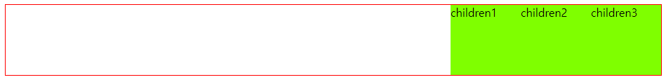
.mother{
border: 1px solid red;
display: flex;
justify-content: space-between;
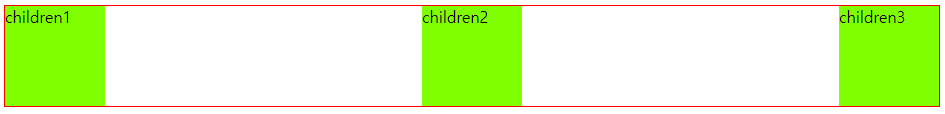
}열을 바꾸지 말고 행을 바꿀 수는 없을까? (align-items)
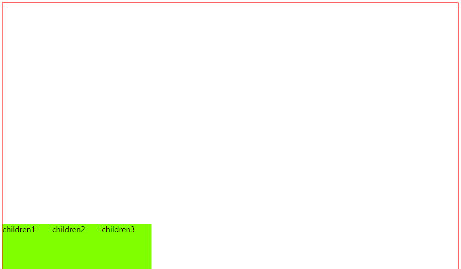
- 이렇게 하려면 부모의 영역(빨간 태두리)을 늘려줘야한다. (height: 100vh 로 늘려주었다.)
- 그리고 justify-content 가 아닌 align-items를 적용해야한다. (flex-start, center, flex-end 등 적용가능)
.mother{
    border: 1px solid red;
    display: flex;
    align-items: flex-end;
    height: 100vh; /*부모 태그의 영역을 늘려줘야함*/
}
이번엔 가로로 나열되어 있는 children 박스들을 세로로 나열해보자. (flex-direction:column)
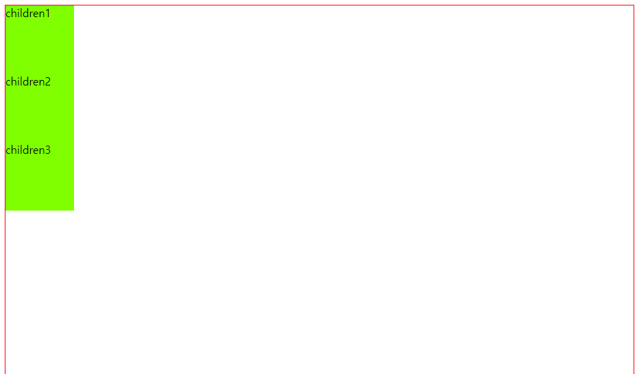
처음 기본 상태와 비슷한 것 같지만 여기에 justify-content: flex-end 를 사용하면 가로로 나열되어 오른쪽 끝으로 붙었을때와 달리
왼쪽아래에 붙었다.
.mother{
border: 1px solid red;
display: flex;
height: 100vh; /*부모 태그의 영역을 늘려줘야함*/
flex-direction: column;
justify-content: flex-end;
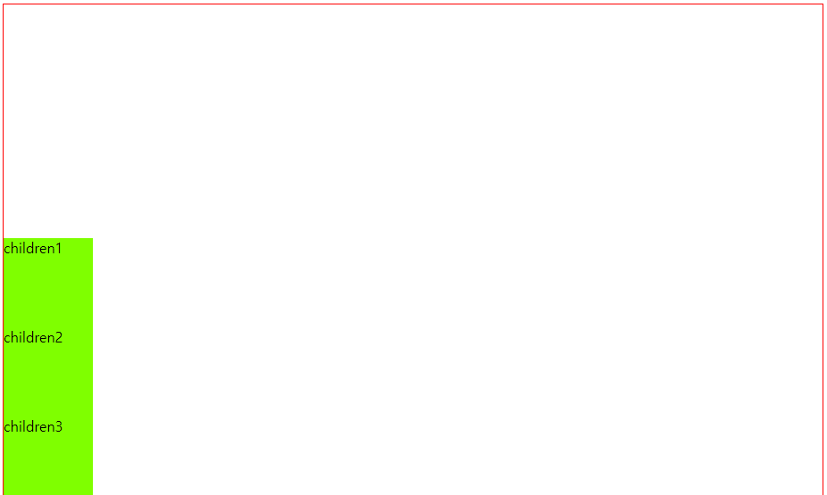
}이유는 flex-direction:column 을 사용하면 방향이 바뀌어서
가로 방향으로 움직이던 justify-content 는 세로 방향으로 움직이게 되고
세로 방향으로 움직이던 align-items는 가로 방향으로 움직이게 된다.
flexbox 를 연습하고 싶다면?
귀여운 개구리 게임을 해보자!
'프론트엔드 > HTML, CSS' 카테고리의 다른 글
| HTML Semantic Elements (1) | 2023.09.07 |
|---|---|
| position (0) | 2023.09.05 |
| 이미지와 글의 줄 맞추기 (0) | 2023.09.04 |
| HTML 자주 쓰는 코드 (0) | 2023.09.02 |
| CSS 연습 (0) | 2023.09.01 |